As the year-end approaches, so do those resolutions we barely keep. Forget all of that. No more two-week diets. This time, it's your interfaces that are putting on weight.
In 2007, skeuomorphism was all the rage, bringing ultra-realistic interfaces. Then, a few years later, iOS 7 sparked a revolution with its flat design.
Today, we find ourselves much closer to flat design than skeuomorphism. But as opposites attract, my interfaces have started to gain some weight—adding a touch of fun and vibrancy in the process.
Here are some juicy, well-stuffed components.
The Candy Button
A round, plump button with an outer bulge and a slightly sunken shape, ready to hug your finger when tapped.
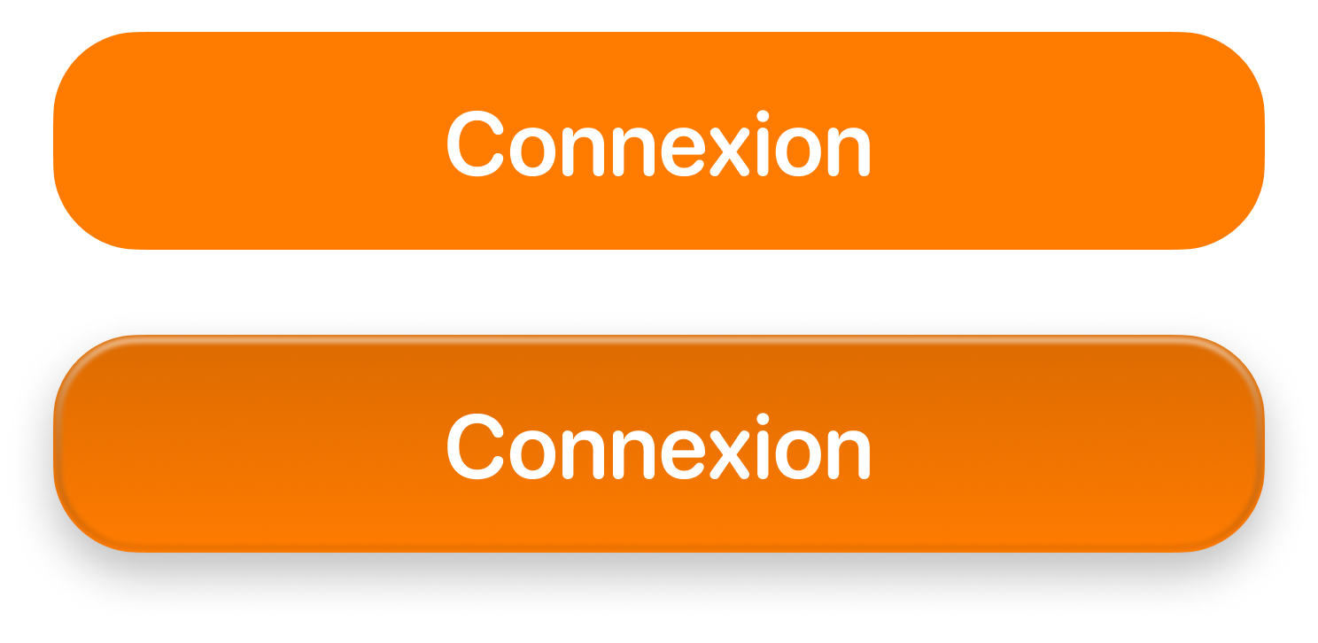
No, this login button won't ask for your password.
The magic of this effect lies in two key details:
- A slightly darkened gradient at the top gives the button a sunken look.
- A white-to-black gradient overlay, lightly blurred, creates the bulge effect, adding depth.
The best part? It works beautifully with a variety of colors.
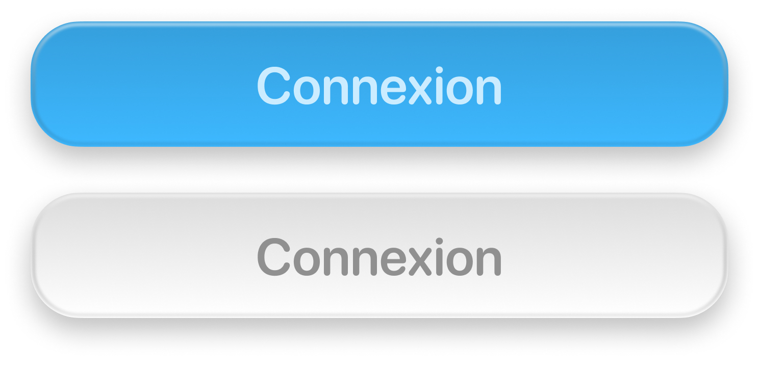
Delicious.
struct CandyButtonStyle: ButtonStyle {
    @Environment(\.colorScheme) private var colorScheme

    private let cornerRadius: CGFloat = 16

    func makeBody(configuration: Configuration) -> some View {
        configuration.label
            .font(.headline)
            .foregroundStyle(.white)
            .frame(maxWidth: .infinity)
            .padding(.vertical)
            .background {
                LinearGradient(
                    colors: configuration.isPressed ? [
                        .accent.mix(with: .black, by: colorScheme == .light ? 0.3 : 0.5),
                        .accent.mix(with: .white, by: 0.1)
                    ] : [
                        .accent.mix(with: .black, by: 0.14),
                        .accent
                    ],
                    startPoint: .top,
                    endPoint: .bottom
                )
                .clipShape(.rect(cornerRadius: cornerRadius))
                .shadow(
                    color: .black.opacity(0.2),
                    radius: 4,
                    y: 3
                )
            }
            .overlay {
                RoundedRectangle(cornerRadius: cornerRadius - 1)
                    .stroke(LinearGradient(
                        colors: [.white.opacity(0.6), .black.opacity(0.1)],
                        startPoint: .top,
                        endPoint: .bottom
                    ), lineWidth: 1)
                    .padding(1)
                    .blur(radius: 1)
            }
    }
}
The Crunchy Card
This rigid, paper-like card feels solid and tangible.
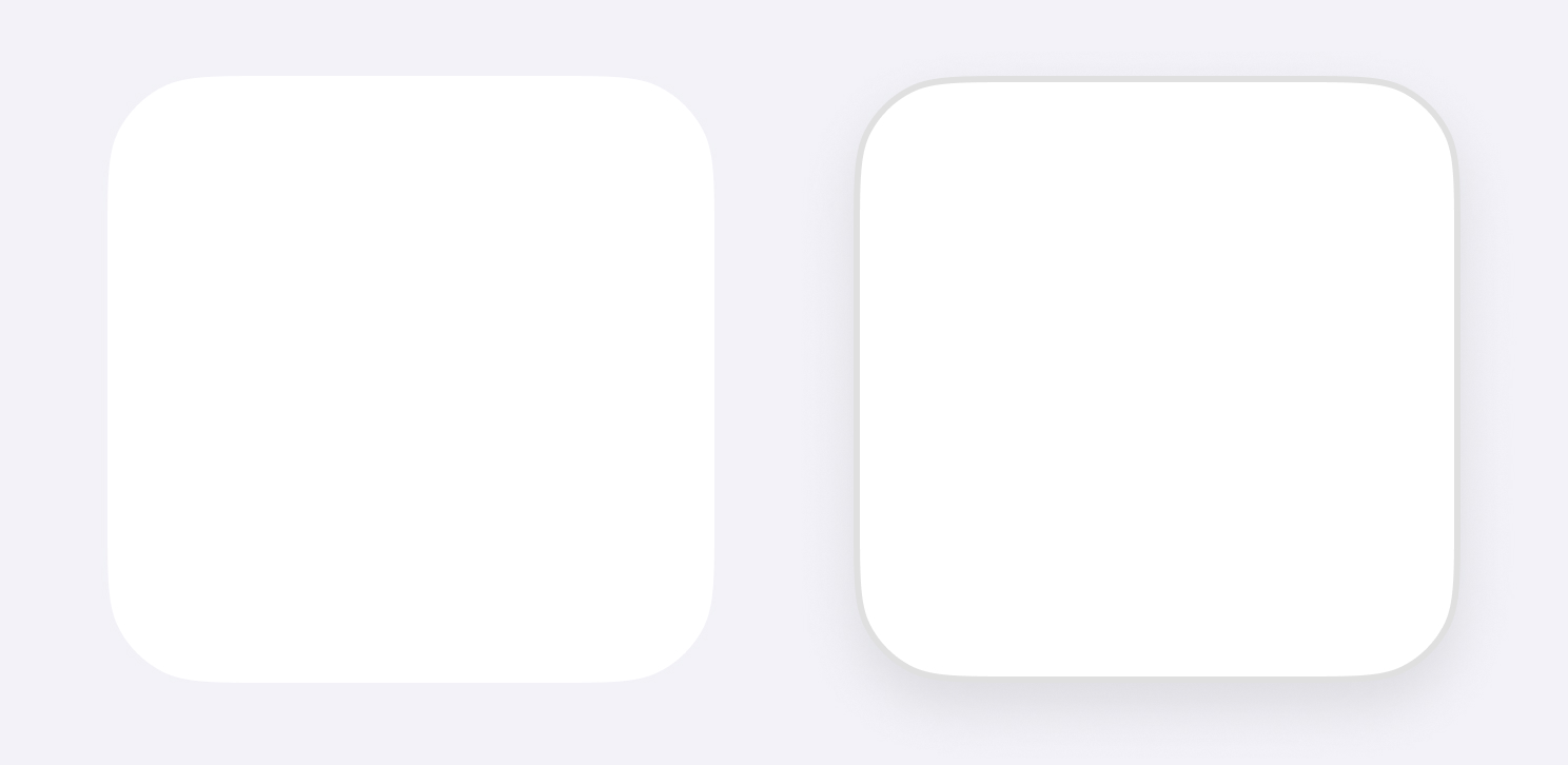
- A subtle shadow is enough to add a touch of relief.
- Adding a darker border (#ffffff12) gives the card some extra volume.
RoundedRectangle(cornerRadius: 16)
    .fill(.background)
    .overlay {
        RoundedRectangle(cornerRadius: 16)
            .stroke(.black.opacity(0.12))
    }
    .frame(width: 100, height: 100)
    .shadow(
        color: .black.opacity(0.1),
        radius: 10,
        y: 4
    )
The Gummy Glass
A variant of the Crunchy Card, this one comes with a blurred background.
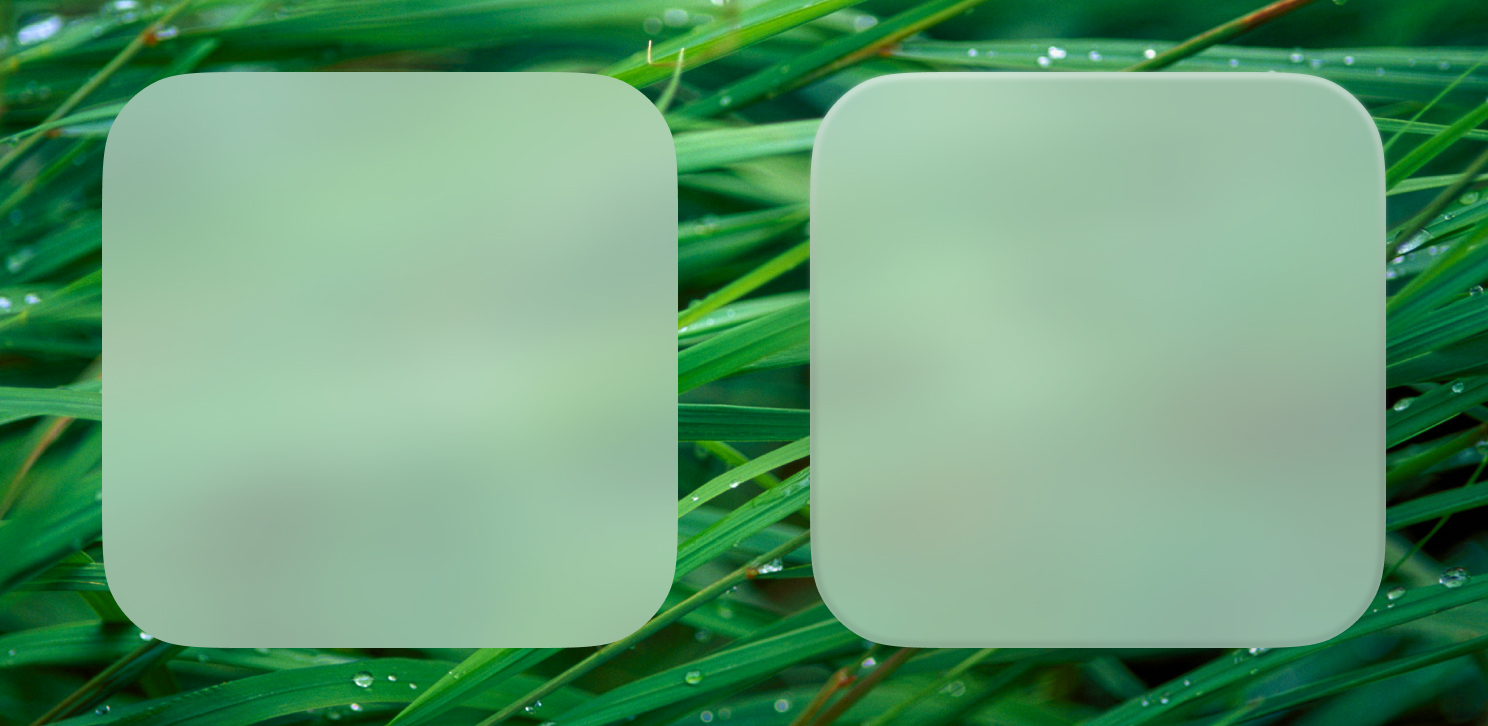 For the nostalgic among you: that background is a gift.
- A white-to-black gradient, just like the button, adds relief to the card.
- Despite the blur effect, a soft shadow enhances realism without overdoing it.
RoundedRectangle(cornerRadius: 16)
    .fill(.regularMaterial)
    .overlay {
        RoundedRectangle(cornerRadius: 16)
            .stroke(
                LinearGradient(
                    colors: [
                        .white.opacity(0.5),
                        .black.opacity(0.1)
                    ],
                    startPoint: .top,
                    endPoint: .bottom
                ),
                lineWidth: 2
            )
            .blur(radius: 1)
    }
    .clipShape(.rect(cornerRadius: 16))
    .frame(width: 100, height: 100)
    .shadow(color: .black.opacity(0.2), radius: 20, y: 4)
Tips for Adding Weight
There are countless design labels out there, but don’t focus on ticking boxes. What matters most is your style and maintaining consistency across your work.
To give your interfaces some weight, remember:
- Think like a photographer: Start with a flat element and imagine it as a real object captured in your environment.
- Imperfections add charm: In real life, nothing is perfectly square or smooth. Use blur tools to soften overly unreal designs.
- Shadows are your friend: They’re a quick way to add volume, but handle with care. Inconsistent shadows between elements can make your design feel cheap.
Now it’s your turn—time to create the best Bouncy Switch ever!