Releasing a new app on the App Store is both incredibly exciting and nerve-wracking. SuperText was no exception. But unlike my previous apps, I found myself days away from launch without a satisfying icon. After a redesign, however, the SuperText icon became one of my proudest creations.
As a developer, I tend to focus heavily on fine-tuning my app’s interface to provide the best user experience possible. But before users can even experience the app, they need to download it—and the first thing they’ll notice on the App Store is the icon (well, maybe the screenshots too, but that’s a topic for another post). Designing an app icon is more than just creating a logo for your iPhone’s home screen; it’s a crucial marketing tool.
Creating the SuperText icon wasn’t easy.
Step 1: Keywords First
Brainstorming keywords that represent the app is my first step. It helps me quickly explore initial concepts and set a creative direction. For SuperText, I identified these key ideas:
- Spell-checking
- Artificial intelligence
- Text
- Simplicity
- Speed
- Magic
Step 2: Seek Inspiration
Next, I dive into what’s already out there, exploring the best of the best in design. Hello, Dribbble! I search for my keywords one by one. The results are diverse and often vague, which is perfect for drawing inspiration from a variety of creative works. I scroll, take notes, and admire the incredible talent and ideas on display.
Step 3: Prototyping
Now comes the fun (and often frustrating) part: sketching and prototyping. The challenge this time? Unlike my earlier apps, the keywords for SuperText weren’t tied to easily visualized physical objects. RPN Calculator? A calculator. Storma? Lightning bolts. But “AI,” “text,” or “spell-checking”? Those are much harder to represent. Time to think outside the box.
I started with the most relatable keyword: text.
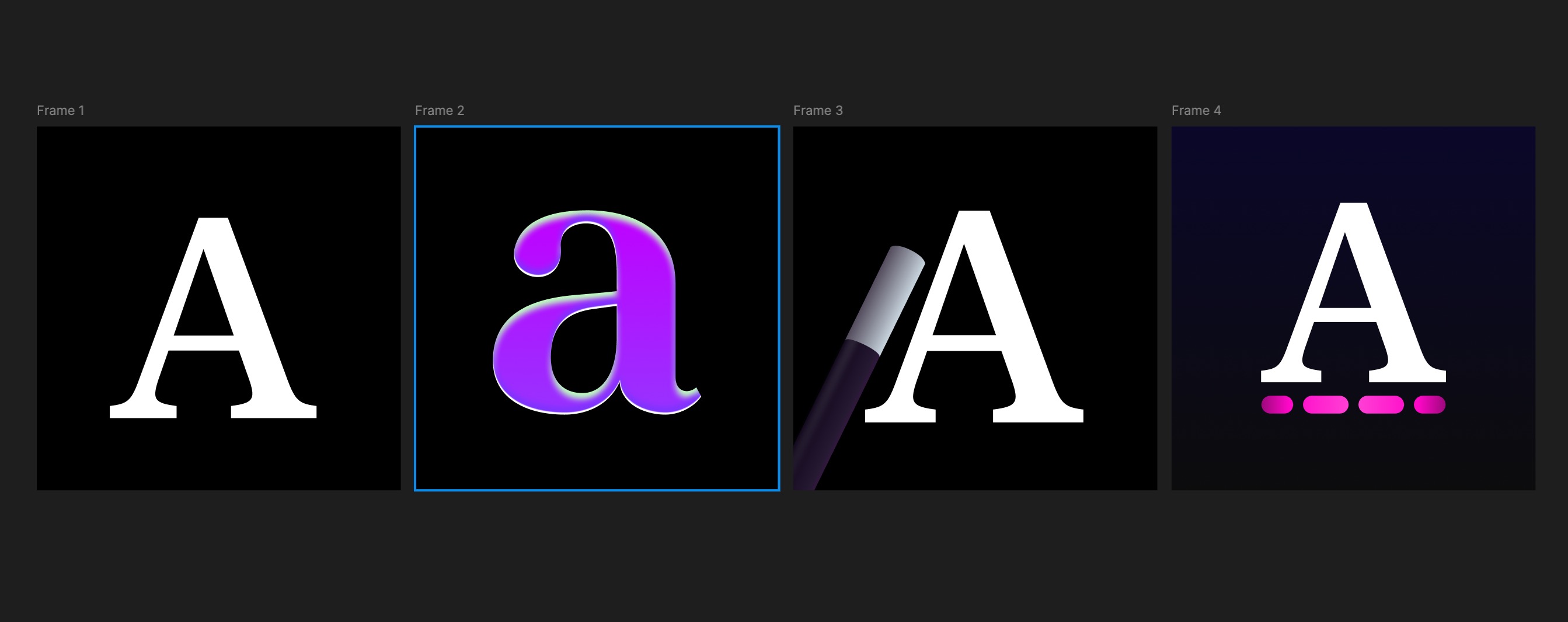 If an AI designed a magical text-processing app icon, it might look as uninspired and soulless as these. The chrome effect on the second icon was a total failure.
 This idea seemed promising, but the symbols were too small to be recognizable.
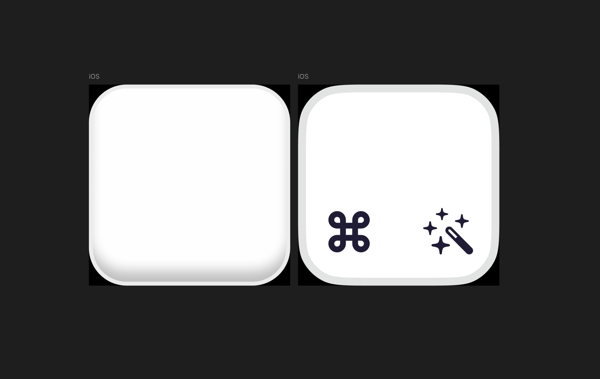
When those attempts didn’t work, I shifted to another keyword: magic. Sometimes, drastically changing direction is the best way forward.
 This icon had a bold personality but strayed too far into “witchcraft” territory, losing its connection to spell-checking.
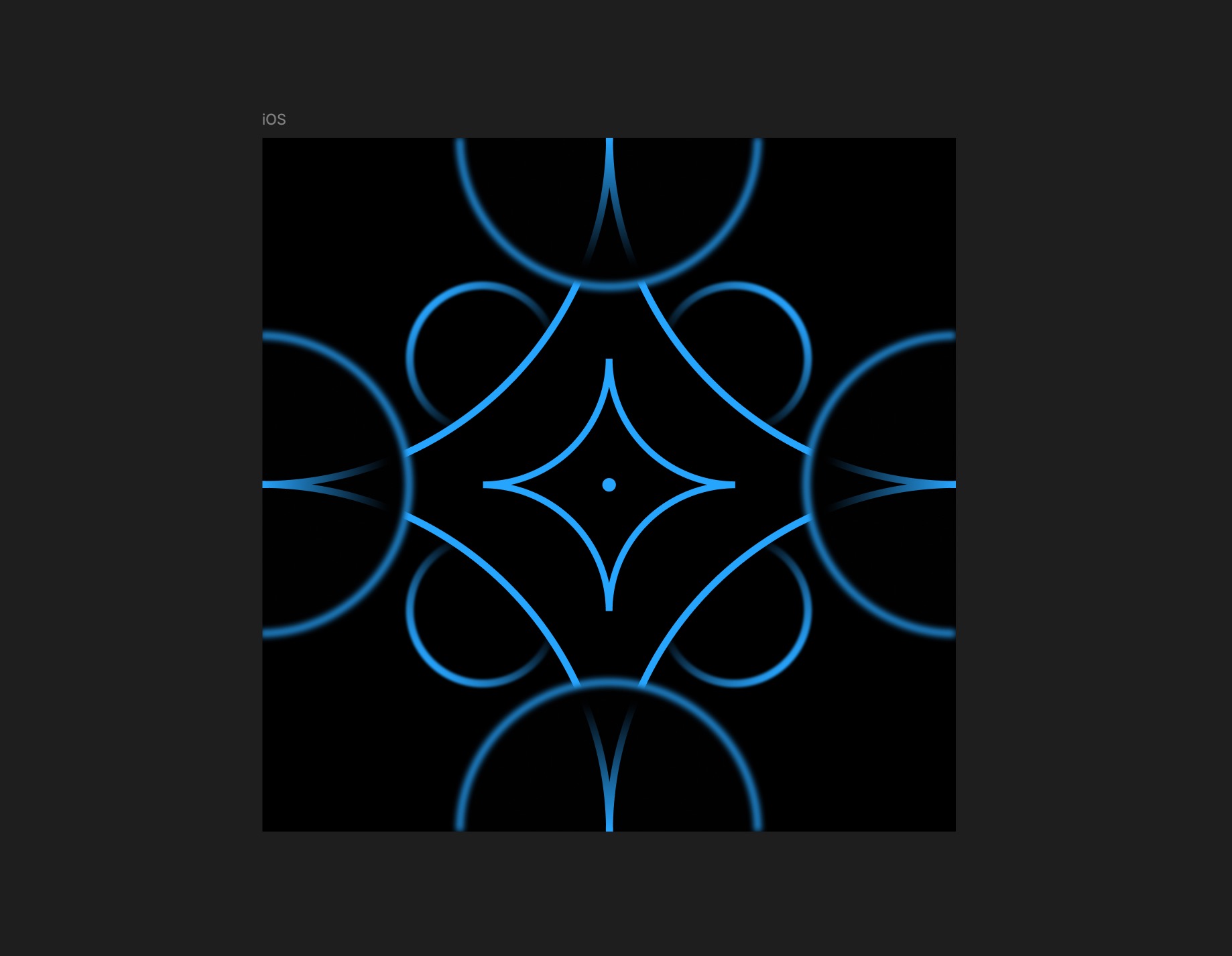
Let’s be honest: the results weren’t great. At this point, why not try something entirely different?
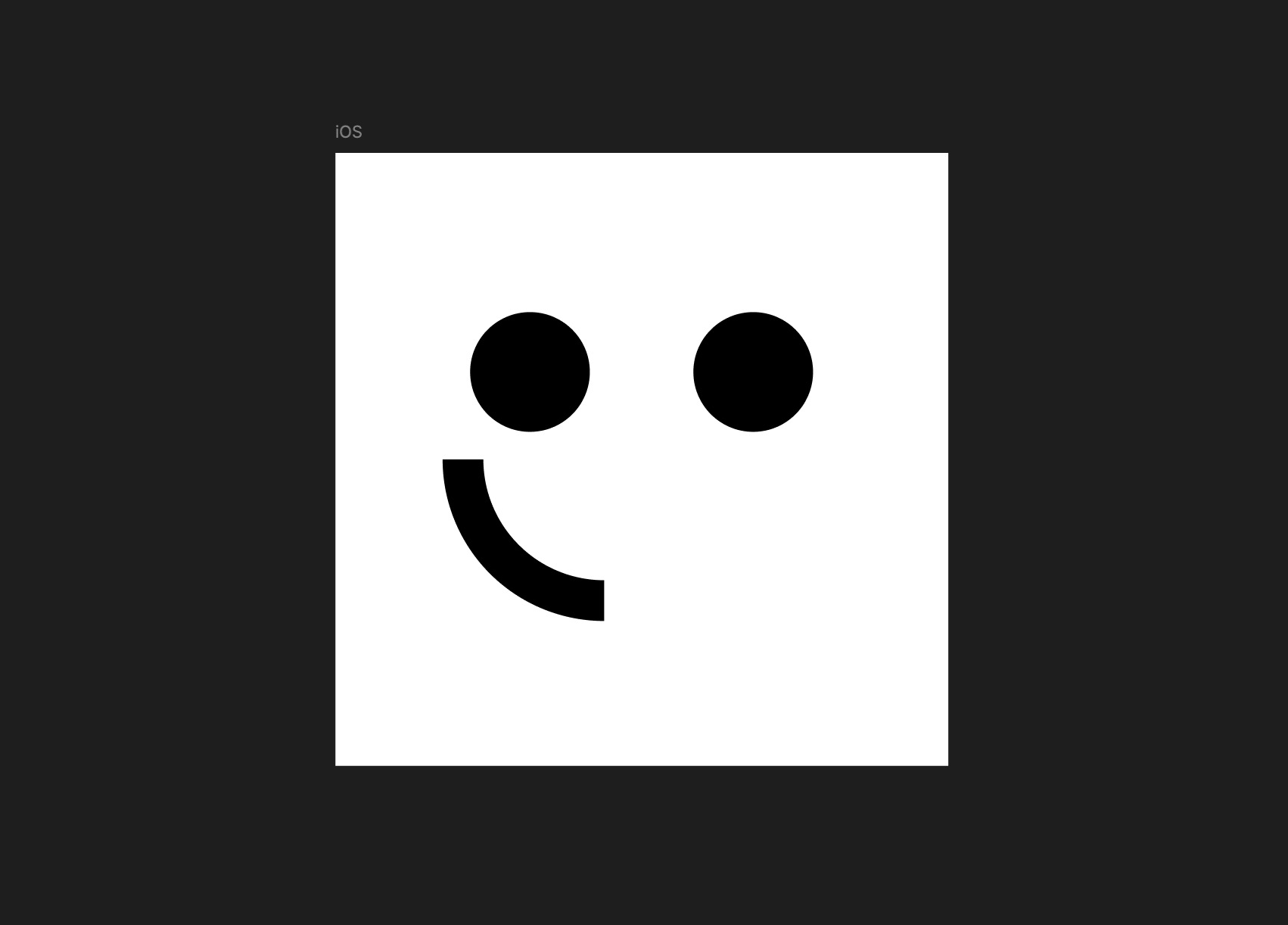 A mascot can make an icon more approachable, but it’s hard to connect this design to the app’s concept.
My initial attempts didn’t lead anywhere. Meanwhile, the app’s development was progressing rapidly, and I was ready to release version 1.0—without a proper icon. I had to make a quick decision. Forget the dream icon; I settled for this:
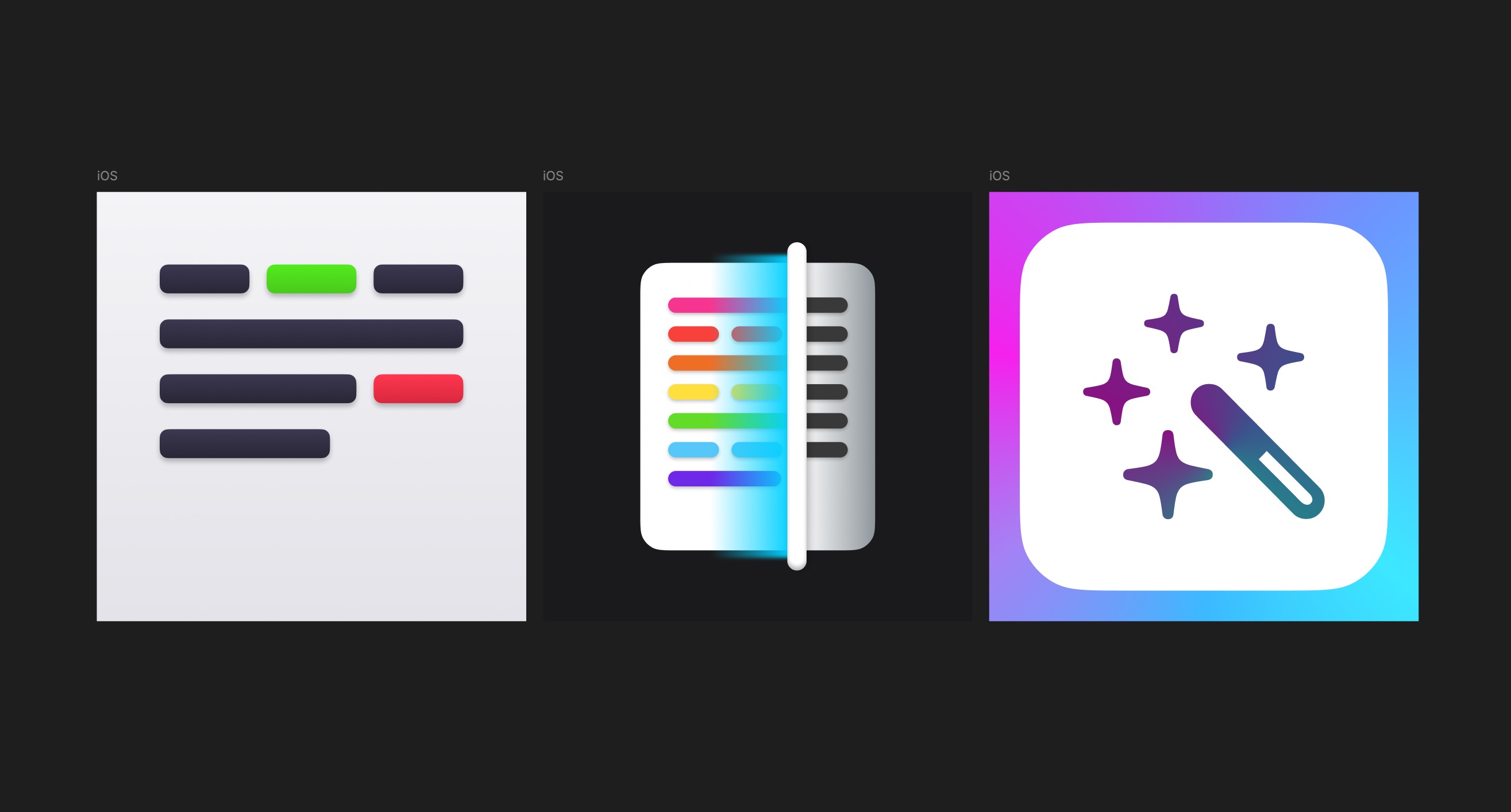 The first one: too plain. The second: blatantly copied from Dribbble. The third: more original but still overly simplistic.
I went with the third icon for version 1, knowing it wasn’t ideal but leaving room for improvement.
Round Two
After the app launched, I had time to step back and approach the icon with fresh eyes. Taking a break and gaining perspective is invaluable when you’re stuck.
For no particular reason, I decided to focus on the “magic wand” concept. Instead of a flat design, I aimed for a semi-realistic style inspired by the shiny moons in Super Mario Odyssey. Their gleaming, eye-catching effect felt perfect.
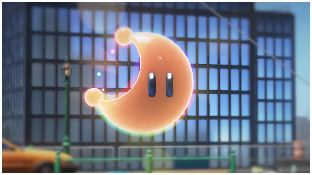 Bright, shiny objects in the game are designed to draw the player’s attention and entice them to collect them.
The more I thought about it, the more the idea clicked. I sketched a new prototype.
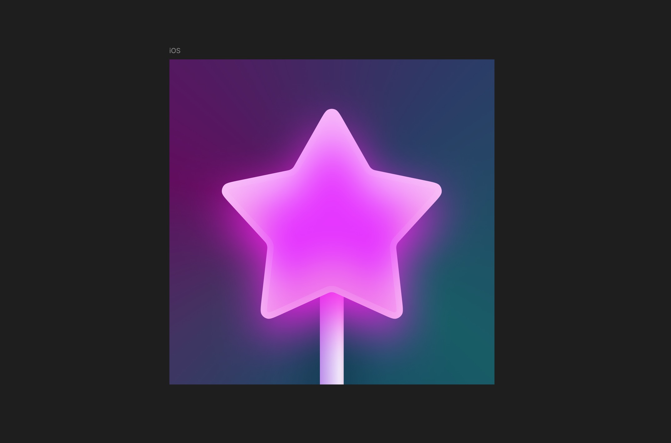
And there it was—a breakthrough! It wasn’t final yet, but the direction felt right:
- The large magic wand made it instantly recognizable.
- The bright, vibrant colors were eye-catching.
- It had a fun, playful vibe.
Here’s how the design evolved:
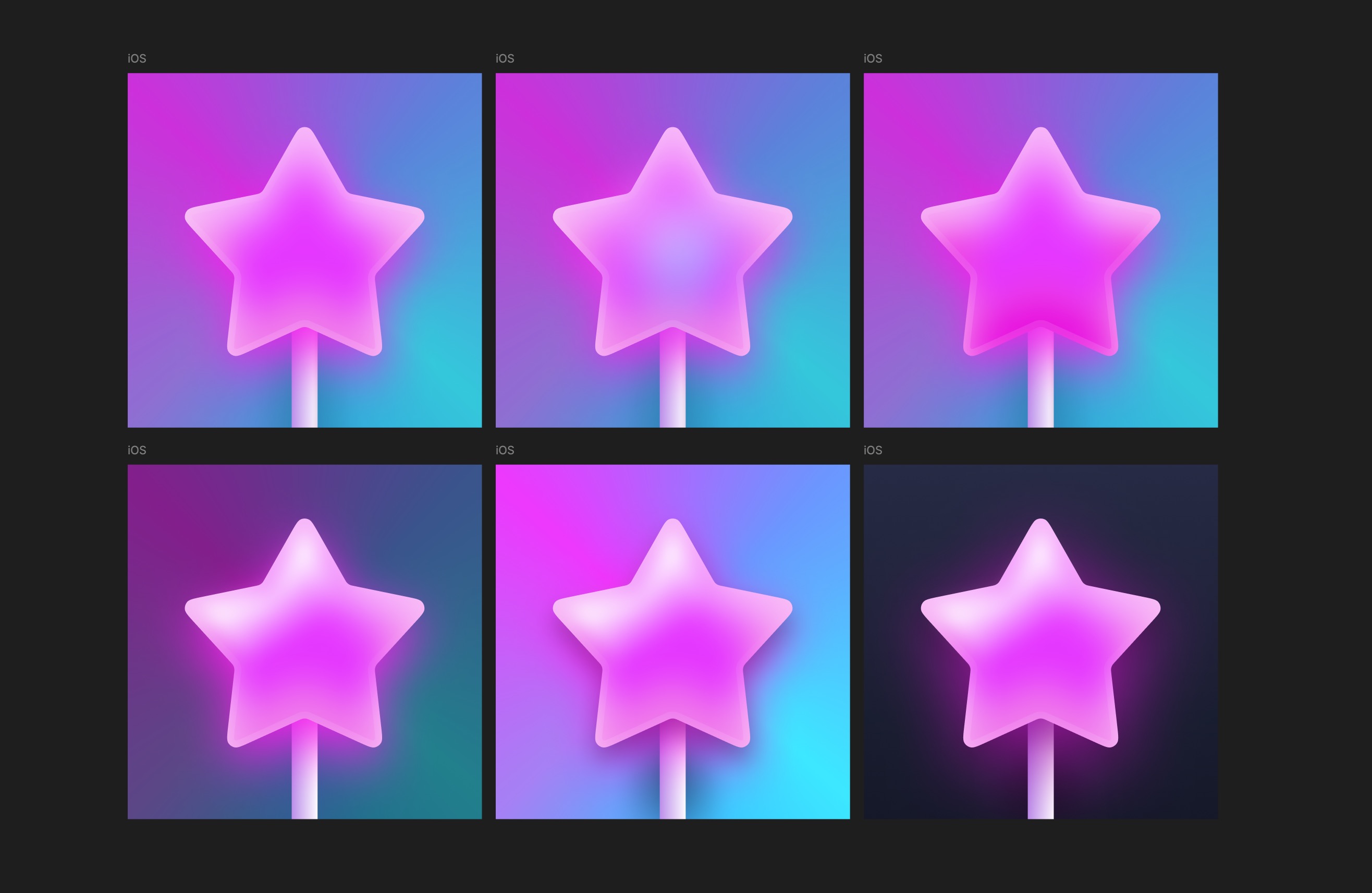 On the first row, I experimented with star colors to make it more prominent. On the second row, I enhanced the shine and highlights for a more realistic effect.
And finally, the finished icon:
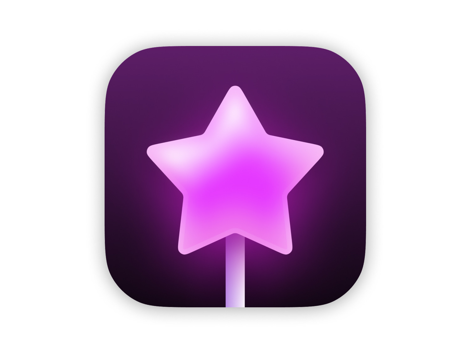 The gradient background, a variation of the app’s main pink color, adds depth and contrast while reinforcing the app’s theme.
I’m genuinely proud of this result! It took much longer than I expected, but taking the time to step back and rethink the design was absolutely worth it.
A Few Tips
- Use subtle white gradients to add depth and shine, enhancing the icon’s realism.
- Colored shadows create a glowing effect, adding a magical aura.
- A background gradient not only adds depth but also ensures the main element stands out, maintaining the app’s visual identity.